Coronavirus – a challenge with the graphs
You keep using that word, I don’t think you know what it means. ~ Inigo Montoya, the Princess Bride
The graphs of coronoavirus cases do not tell us the number of infections in a country. They tell us how effective we are in measuring infections in a country.
I have been thinking about this reflecting other other examples from my career:
- I was the Quality Manager of a manufacturing company. My reports told me the performance of our quality system, but not necessarily the quality of the product. Saying we had a defect rate of 0.5% didn’t mean much to the customer returning the latest shipment. Reports can make us look like we are performing better than we are.
- As General Manager of a digital studio, our profitability reports reflected how much we were invoicing and timesheeting, not the performance of the business. It is difficult to make decisions if our reports are based on data that is not complete or accurate.
- As I have discovered a few times driving my car, my fuel gauge tells me the performance of my dashboard indicator and not the fuel levels in the tank. Relying on faulty reports can have disastrous consequences and stop us from moving forward.
- In measuring entrepreneur ecosystems, some may report the total number of startups. Except this relies on a shared definition of a startup and knowing the total population. Because these are often ambiguous and unknown, any ranking becomes difficult if not impossible. Using reports to compare ourselves to others requires everyone to have similar definitions and measurement systems.
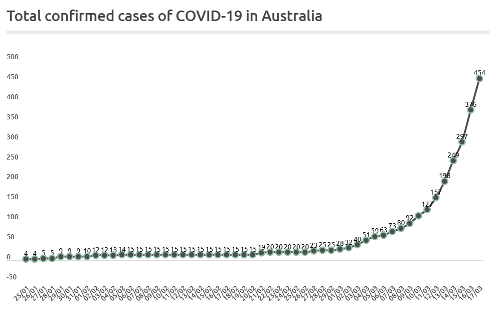
In countries such as Australia and the US, we are just now seeing dramatic increases in the number of reported cases of people infected with COVID-19. This does not mean that more people suddenly have the virus. It simply means we are shining a light on a problem that has been among us the whole time.

It’s like those old monster movies where the flashlight slowly pans to reveal the monster lurking in the shadows. The audience gets scared, even though the monster was there the whole time. We are afraid of the unknown horrors of the world.
There are a few responses to this.
- One is to treat the reports like reality, ignoring the underlying truth. The reports can look good if we just don’t test. It’s like turning off the flashlight, closing our eyes, and wishing the monster away.
- Another response is to test everyone so the reports reflect reality. It’s like trying to manufacture a sunrise to expose the monster. It can be done and some people are giving it a go, but it is costly and takes time.
- A third response is to control exposure and create indicators around our measurement. It’s like locking ourselves in a room with controlled entry points and keeping track of where we are shining our light.
With social distancing, we are controlling access as much as possible. But like any movie goer knows, the monsters still slip through the window, the closet, or the magic portal under the bed.
What would really help would be side-by-side data on the graphs about number and nature of tests. In the interim, low numbers on graphs should not lull us into a false sense of security and lack of action.
By the same token, graphs with fast growth curves should not make us afraid. People around us were infected well before lines showed up on a graph.
I am grateful in Australia for our health and social systems, which will be put to the test over the coming weeks. An addition to existing graphs on the number of confirmed cases, including the number of tests performed and where they are performed would be a good indicator to understand the current situation.
In the interim, we can assume that there are a significantly greater number of people infected around us regardless of what is on the graph.